|
|
Rabindranath Tagore and his World of Colours
The full title of our book can be translated as ĹTagore of Colours/
A Study of the Use of Colour in the Writings and Art of Rabindranath Tagoreĺ.
The book is quite a tome, 800 + pages, mainly in Bengali but with about
50 pages in English, with 126 illustrations. We toiled on the project for
the best part of half a decade, against many odds. We believe the publication
has some importance at a pan-Indian level, and indeed, at an international
level, but as Ś regrettably Ś books in the Indic languages are almost never
noticed in Indiaĺs or the worldĺs English-language media or scholarly journals,
knowledge about the existence of such a book will not spread beyond the
Bengali-speaking areas of the subcontinent unless we ourselves come forward
and tell others about it. I shall try to present an overview of the work
and (hopefully) generate some interest in it. How did we come to do this
work? What did we put into it? Why should any of you be interested in it?
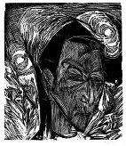
Fig. 1. Ernst Ludwig Kirchner, ĹDavid Muellerĺ, woodcut, 1919
The idea of this research project germinated in my mind in the first quarter of 1989, when I was working in Santiniketan on another Tagore project Ś the translation of his poetry. One of those days, I had a visit from Dr Jyotirmoy Bose, an ophthalmologist who had done valuable work on the achromats of Bishnupur in West Bengal. Achromats are people who have no perception of colours, who see the world as black and white, and gradations of grey. Dr Bose came to reminisce with me about his former teacher, the late Captain Kiron Sen, to whom I owe a lifelong debt of gratitude for having saved my eyesight by means of two decisive surgical interventions in 1959-60. In those days Captain Sen was regarded as the most eminent eye surgeon in Calcutta. It was thanks to his skill that I did not slide into the land of the blind, was brought back to the land of the sighted, and was able to take up a scholarship and come to study in Oxford in the autumn of 1960. Captain Sen, to whom I eventually dedicated my first published book, was like a father to me. When he came to a conference in Oxford, he visited me in my student Ĺdigsĺ, listened to me playing Rabindrasangeet tunes on a Hawaiian guitar (as was done in those days!), and took me out to dinner in the Randolph, Oxfordĺs premier hotel, which was quite out of bounds otherwise for a humble undergraduate from the Commonwealth. After sharing with me his memories of that great personality, Dr Bose gave me to read a short paper he had himself written, jointly with the British vision scientist R. W. Pickford, on colour vision and aesthetic problems in pictures by Rabindranath Tagore. Reading this paper, I learned for the first time in my life that Tagore had probably had a partial colour vision deficiency, the kind known as protanopia, in which the wavelengths of light that we see as the colour red are lost to the eye, and there is confusion between red and green in perception. It is not an illness, just a genetically inherited condition. There is no Ĺcureĺ for it. I was amazed at this discovery, because up to 1989 I had never heard the subject discussed in Tagore circles. When I read the Bose-Pickford paper, it was like an explosion inside my head. Suddenly certain enigmas, certain aspects of Tagoreĺs art, the objections of certain critics to some of his poetic imagery, his obvious desire to say the same thing over and over again in slightly different ways Ś all began to fall into place. What a splendid opportunity, I thought, to mount a full-scale, interdisciplinary investigation, with the help of other scholars, into the colour world that Tagore inhabited. I immediately resolved that I would personally survey the 30-volume Visvabharati edition of Rabindra-rachanabali, to investigate the effects of his colour vision on his literary language. I invited Sushobhan Adhikary to help me with the art side of the project, and he agreed with enthusiasm. A Fine Arts graduate of the Kala Bhavana, Sushobhan is himself an artist. He had been involved in the cataloguing of the Rabindra Bhavana collection of Tagoreĺs drawings and paintings, the largest collection of Tagoreĺs art held in any one place. In the course of his work as a Preservation Officer at the Rabindra Bhavana, he had acquired an intimate and thorough knowledge of the collection. He had helped me before in a previous project when I was seeking to understand the nexus between Tagoreĺs art and Victoria Ocampo, and I had been struck by his remarkable visual intelligence. Straight away in 1989 we started our preliminary investigations. In no time Sushobhan found a passage in Chhinnapatrabali (Tagoreĺs letters to his niece Indira Devi) where Tagore jocularly refers to himself as ôa celebrated colour-blind personö. Those who had noticed it seemed to take the statement more or less as a joke. How they could do so when (as we soon found out) a few of Tagoreĺs contemporaries Ś Rani Chanda, Romain Rolland, Stella Kramrisch, Rani Mahalanobis Ś had actually left some published comments on the subject of Tagoreĺs colour vision, was a mystery to us. Barring exceptions such as Satyendranath Roy, Shankha Ghosh, Shanu Lahiri, and K. G. Subramanyan, who encouraged us to go ahead and explore the subject, scholars seemed to maintain an air of amused indifference to the possibility of a colour vision deficiency in Tagore. If told about it, they would sometimes respond with a ôSo what?ö Ś as if such a possibility could make no difference to our understanding of the great man. It seemed obvious to us, however, that a colour vision deficiency was bound to Ĺcolourĺ a personĺs entire psychology of perception, and if that person was a poet, a writer, an artist, it would surely have important consequences in his writings and art. We discovered that there were indeed some references to the subject of Tagoreĺs partial colour-blindness in articles by Shobhan Som; and one or two others, in the subcontinent and even in North America, were also aware of the issue; but it would be fair to say that no detailed study of the subject had been attempted, and we resolved to do just that. The explicitly scientific-technical side of our project was looked after by my husband Robert Dyson and our friend the distinguished visual scientist Adrian Hill of Oxford, who had done significant work on the connections between the painter Claude Monetĺs cataracts and certain developments in his art which have come to be associated with Impressionism. In 1991 they accompanied me to Santiniketan to do colorimetry on a selection of Tagoreĺs paintings. In the beginning Robertĺs role was to give computational support to the measurements, but he ended up reading widely in the field of colour vision and taking an active part in the project, advising us about the many scientific issues that kept cropping up throughout the duration of the project and helping also in the writing up of the scientific-technical pages. For reasons of space, I shall not say much about this side of the project here, as the pages relating to it are given in the book in English, and those interested may look those pages up directly. There is a brief general introduction there to the salient issues of colour vision. The colorimetry of Tagoreĺs paintings revealed results that matched with the trends of protanopic perception and art already known to scientists. What was it that spurred me to embrace the idea of this project so enthusiastically? It is good sometimes to pause and reflect for a while on what does and does not get done in the world of research. If something does get done, then who actually does it? What made me think I could lead such a research project in the first place? I think it was because I did nurture within me a combination of interests which matched the requirements of the project, a willingness to draw into it others who had skills which they could contribute and whom I could trust, and a stubbornness to continue with it in the face of obstacles. An interdisciplinary project cannot take off unless there is an overlap of interests in the person initiating the process. At the same time, it cannot be satisfactorily completed without the active input of co-workers who contribute their different specialisms. We should also note another crucial factor. This research project could only take off because we were prepared to work on it for several years without any core funding whatsoever, sloshing it with our own money. Often this is the only way pioneering and offbeat projects can be initiated and sustained outside an institutional framework. My actual formal background in the area of scientific knowledge was diminutive. I had read Philosophy as one of my Pass subjects at Presidency College, Calcutta. Certainly, the course had covered a discipline called Psychology in a rudimentary sort of way. We had a textbook with diagrams of the eye and the ear. The great importance of the processes of sensory perception and names such as Helmholtz had been etched onto obscure niches of the consciousness. More importantly, being married to a person who belonged to the world of science and technology, I had over the years learnt a lot from that world. Science and technology were areas which had been neglected in my formal education; precisely therefore they were areas I had assiduously cultivated as an amateur in my British life, reading popular science journals, watching TV science documentaries, and learning how to make the computer a tool in the writing process. Added to this interest in science and technology acquired not from the classroom but from life, was my natural interest in the business of vision, having had eye surgery myself at a young age. That was a period of genuine crisis in my life, when I prepared myself mentally for the eventuality that the operations on my eyes might not be successful after all and so I might have to read books in Braille for the rest of my life. I also had a genuine interest in painting. I had indeed painted in childhood, having been encouraged thereto by my father and my art teacher at school (who later became a well-known artist, Reba Hore). I had entered art competitions as a schoolchild, and had even secretly wanted to go to art school. As a young girl, I used to go religiously to the annual exhibitions of the Academy of Fine Arts in Calcutta, eyeing the celebrated Lady Ranoo Mookerjee from a distance. Amrita Sher Gil and Sheila Auden were names known to me from very young days indeed. I was interested in French Impressionism, and inspired by reproductions of Monet, painted young ladies walking in the rain, holding umbrellas. Finally, Caroline Spurgeonĺs studies of clusters of obsessive, iterative imagery in Shakespeare had made a deep impression on me from my earliest days as a student of English Literature at Presidency College. I had a hunch that if Tagore had had a colour vision problem, a close study of his language, his images, his similes and metaphors, would reveal it. A repetitive pattern would emerge, consonant with the peculiarity of his vision. I therefore leapt at the idea of a project using the colour question as a probing key, which might open other doors. My aim was to draw on the expertise of different disciplines, to combine the methods of academic investigation with our insights Ś Sushobhanĺs and mine Ś as creative artists, with the scientists acting as our consultants. I also wished to highlight the process of inquiry itself. We did not simplistically assume that Tagore was a protanope. We started our investigation with an open mind. There were two halves in a circular process. In one semicircle we said to ourselves, ôLetĺs see what the evidence is. This man wrote from his boyhood till he was 80 years of age. What does his use of language tell us? Every child inherits a colour language with his mother tongue; he learns the usual colour-names, whether or not his perceptions match those of others around him. Is this boy using his colour language differently? When does he become aware that he is different from others? When does he become self-conscious about it? What does the history of his becoming a visual artist tell us? What does the colorimetry of his paintings tell us?ö In the other half of the circle we found ourselves asking questions such as the following. How did Tagoreĺs colour vision affect his colour imagery, his language of direct description, his language dealing with remembered scenes and abstract concepts, his figurative language, his use of similes and metaphors, his language of emotions? Words are like bricks. We may think that the bricks this writer is using to build his tower blocks are just the same as those used by others, but if, in reality, some of his building blocks are different, if Ĺredĺ is not what others mean by Ĺredĺ, if Ĺgreenĺ is not what others mean by Ĺgreenĺ, then how does that difference affect this writerĺs style? How did Tagoreĺs colour vision affect the process of his becoming a visual artist? Was this the real reason why he took so long to become a visual artist, despite his avowed attraction to the art? By what route did he come to the practice of visual art? From where did he learn? Were there foreign influences along the way? How does he use form and colour? What is the relationship between those two components in his paintings? Gradually a huge circuit diagram began to build up. And it was absolutely thrilling to see that a clear pattern did emerge, consonant with a protanopic hypothesis. Our book is a record of that circuit diagram, becoming, in the end, like a star chart. Perception is indeed a private process, each person being his or her own processor, but when the perceiver is also a compulsive communicator, we are inevitably allowed innumerable glimpses into that private chamber. Our conclusion is that Tagore does indeed have a very special colour language in both verbal and visual communication, a very special way of relating to the world of sensory perception. Because he wrote so much, my literary surveys yielded a Himalayan quantity of data. And because I did not want any Tagore fans claiming that I was inventing Tagoreĺs protanopia on slender evidence, I decided to give the results of my surveys as fully as was possible, which is the principal reason why the book is so bulky. I did not want to omit any evidence. I wanted the cumulative evidence to speak for itself. I was fired by the example of those working on the map of the human genome and wanted to emulate their attention to detail. I wanted readers to see for themselves how Tagoreĺs language, in page after page of the Rachanabali, actually handles colour. It was not just a question of simple word-counts. Examining the effects of a colour vision deficiency on a writerĺs literary language, especially when the problem was not publicly acknowledged, was a much more delicate and complicated business. Skimming the surface of things would not have yielded reliable results. I had read Tagore from childhood, but never imagined that he had any problem with his colour vision. His colour vision is indeed imprinted on his language, but to see that imprint clearly I had to make a targeted search and descend below the surface of the language. It was like diving into the sea. That was also why the bulk of the book had to be written in Bengali. People who do not know Bengali have sometimes expressed dismay that such an interesting piece of research, as they see it, is not available in English. I donĺt think that is a helpful attitude. No scholar should have to apologize for writing a book on Tagore in Bengali. If Tagore has status, then the language in which he wrote should also have status. Those who wish to be in Tagore studies have to be able to read his language. The bulk of our book had to be written in Bengali from sheer necessity. I had to attempt a microscopic survey of the habits and texture of Tagoreĺs language vis-à-vis colour and the act of seeing, while taking in the details of his other sensory perceptions as well as his sonic pattern-making. Did his other senses tend to compensate for the loss in colour vision? Is that why his poetry is so exceptionally rich in references to fragrances? Is the emphatic musicality of his poetry or his genius as a musical composer a compensatory development? Why does he often say that seeing has to be Ĺtranslated intoĺ hearing? Did he develop any special vocabulary to overcome his problems? The very fabric of his language had to be examined. I had to wind in and out of quotations. Such a discourse would have been impossible in any language except the language of the texts that were being explored. To connect with the literary surveys, to give generous cross-references, to generate a continuous and enjoyable text, the art chapters had to be written in the same language. I found that Tagore tends to favour certain colour-words over others. He uses traditional Sanskrit-derived colour-words and the more colloquial Persian-derived colour-words in different ways and contexts. The most commonly used words for red and green in Bengali, lal and shobuj, are not common choices for him. He prefers more ambiguous terms like ranga and shyamal, thoroughly exploiting their inherent ambiguities. He uses the adjective shyamal to convey a wide range of shades, from the colour of leaves to the colour of the soil and of the human skin. He also gives it a symbolic resonance. It is clear that his perception of green was different from that of most others. He tends to refer to reds in a roundabout, often anomalous, manner. When describing sunsets and sunrises, he frequently feels frustrated and helpless, and concentrates on the colour golden. In keeping with this, the sunset or sunrise skies in his landscape paintings are uniform expanses of yellow or orange-ish yellow. In his poetry and songs he often connects the colour red to pain. The season of spring may dye his pain of viraha ôwith the redness of the kingshuka flowerö. In his prose he uses minor examples of red, such as the reddening of eyes or skin in anger, embarrassment or humiliation, routinely and obsessively to mark the stages of his fictional narration. This is noticeable even in a major novel like Gora, and once we become alerted to this feature, we see that it is a descriptive device which is almost involuntary, like a tic. It is as if he saw the surges of colour in a personĺs face or eyes more clearly than others, just as complete achromats are known to be more sensitive than people with full colour vision to the many shades of grey. Or it is as if, having grasped that this was an example of Ĺredĺ, he was determined to demonstrate to the world that he could detect the slightest tinge of it. Sometimes, too, he will boldly refer to the colour red in a context such as a night scene, in which our colour vision is actually minimal. He talks about the leaves of the krishnachura (the gulmor), about rain on them, sunlight through them, their branches at night, but never about the dazzling beauty of their red flowers. He travelled widely, but never describes the colour of autumn foliage in Europe and North America. He tends to associate that colour (whatever he saw of it) with decay and death. Red, which he probably perceived as a darkness, as an absence of colour, is used by him regularly in negative associations and contexts. He displays a definite phobia about blood, which he probably perceived as a near-black liquid, almost always connecting it with violence and aggression, and seldom with vitality, which is the more common association in Bengali usage. Negative images of red occurring regularly in his texts Ś red in the contexts of shame, anger, death, violence, disease Ś exist alongside more tradition-derived images of red as auspicious and festive, which are inherent in the Indian tradition, creating a curious counterpoint, an oscillating pattern of colour-values. When he wants to evoke images of good red, as opposed to bad red, he often uses emphatic sound-patterns to bolster them. Witness these lines from a well-known song: Ranga hashi rashi rashi ashoke polashe,
I happen to have translated this song and this is how I rendered these three lines: Red is the laughter piled in polash,
ashok.
An assortment of reds, from the very vivid to the marginal, is here strung together by the thread of sound. Time and time again, I found that Tagore uses sound-effects or sonic imagery or a mixture of both (such as ôroktoronger kinkinijhankarö, ôthe girdle-bell-ringing of the colour redö) to convey the red colour, using the aural as a pathway to the visual. Blue, on the other hand, is his favourite colour, his specific language of joy, the very talisman of existence. ôTobu, he apurbo rup, dekha dile keno je ke janeö Ś ôYet, o beauty never seen before, who knows why you appearedö Ś he says to the violet-coloured flowers of the petrea volubilis, which he nicknamed the Ĺnilmoni-lataĺ or the blue-jewel-creeper. After probing thousands of pages of Tagore with the key of colour, I realized that Tagore would have never said that to a red flower. Introduced to Birbhumĺs soil by Tagoreĺs friend W. W. Pearson, the beautiful petrea still blossoms in Santiniketan. When Sushobhan first brought me some of its flowers to look at, I remember saying to him: ôThis is the nilmoni-lata? But it isnĺt blue, it is violet!ö Yes, like most bluebells, and lavenders, despite the song ôLavenderĺs blueö, the petrea is violet rather than blue. With reds becoming dark, Tagore probably perceived violets and purples as enchanting varieties of dark blue. In Tagoreĺs colour symbolism blue is existence, blue is rup, blue is lavanya, blue is ananda. Red is often unknown, unseen, a-jana, a-dekha, associated with duhkha and vyatha. Indeed, once we delve into the depths of his mature texts we realize that Tagore is often acknowledging his problematic vision of red, but only obliquely. ôTomar ashoke kingshuke/ alakshyo rong laglo amar akaroner sukheö Ś ôIn your ashok and kingshuk/ an invisible colour touches my happiness without reasonö Ś so he says to Phagun, the first month of spring. Singers sing the words without taking in the subtext behind the text. In the play Raktakarabi the red oleander is developed into a mighty, ambiguous symbol, a kind of mysterious, elusive, terrifying, terrible beauty which is connected with tragedy and death. The King is desperate to understand the meaning of its colour. Blue and yellow form Tagoreĺs favourite colour contrast, as in the famous song on mustard fields in blossom (ôNil digonte oi phuler agun lagloö Ś translated by me as ôA fire of flowers has hit the blue horizonö). Rongin, meaning Ĺcolouredĺ, seems to be his private shorthand for red or any colour combination in which red plays a part, or in which colours difficult for him to distinguish combine to make a pattern. He often refers to clouds as rongin, coloured, instead of referring to their actual colours. The way he goes on and on about coloured clouds, one wonders if he perhaps imagined there were more colours in such scenes than there were in reality. He made up a whole myth about it. The coloured cloud, rongin megh, becomes a powerful symbol in his poetry and songs. In reality, spectacular displays of multiple colours in clouds happen only in very rare atmospheric conditions. And interestingly, though he talks a great deal about coloured clouds in his writings, he does not paint them in his pictures. There he gives us flat stretches of golden skies. The very words rong, colour, and rongin, coloured, become powerful symbols in Tagoreĺs language, charged with multiple meanings. Amazingly, what is rongin, coloured, is often also korun, or sad. This association becomes comprehensible if one remembers that rongin is his private shorthand for that which has some red in it. He could be said to be obsessed about colour. He has a range of jokes which can only be called Ĺcolour humourĺ. Often and often he says nana ronger, Ĺof many coloursĺ, instead of specifying which colours, presumably bypassing problematic descriptions. Tagore also developed a unique vocabulary of light and dark, shadows and luminosities, in both verbal and visual language. Light versus dark is his most repeatedly used visual contrast in both literature and art. I wonder if any other poet has written so obsessively about the skyĺs canopy and its stars. He also develops an elaborate discourse about seeing and not-seeing. Not-seeing becomes a powerful symbol for touching the sacred. Or it is a curse from which one has to be freed in order for the same condition to be seen as a blessing. The unseen becomes a spiritual metaphor, the invisible lord, the king of the dark chamber. This glorification of the unseen and the invisible reaches its apogee in the play Raja. The relationship of Sudarshana to the King is usually explained by Tagore exegetes as the relationship of man to God. But it is precisely this: she can know him by all the senses except that of sight, which is more akin to Tagoreĺs own relationship to the colour red. We need not deny the existence of a spiritual meaning, but the spiritual is likely to have been kicked off by his sense-experience, just as so many of his sacred songs are the fermented alcohol of human grief, of personal bereavement. When I asked Sushobhan Adhikary to join our project he had already started gathering material for a projected dissertation charting the route whereby Tagore became a visual artist and tracing how his thinking developed in respect of art, stage by stage. Sushobhan discontinued that project, generously contributing that material to our book. This reconstruction of Tagoreĺs development as a visual artist and the evolution of his art-related thinking, inclusive of certain characteristic, eloquent silences which conceal steps in his development and deflect attention from them, is one of Sushobhanĺs important contributions to this book. From his knowledge of art history, he had certain hunches about what needed to be looked at more closely in the history of Tagoreĺs development as an artist, for example, the influence on him of Primitivism and Expressionism. Both had been loosely cited as influences, but a proper account of these influences had not been written. Some had even rejected any ideas of significant foreign influences on Tagore the artist. Tagoreĺs art was clearly not traditional, yet it was trendy to say that it owed nothing to anybody, that he wove all his art out of his own belly, like a spider weaving its web. As a practising artist, Sushobhan did not agree with this point of view; he said that that was not the way the imagination of visual artists worked, that, on the contrary, artists were very susceptible to the influence of visual language, just as poets were susceptible to the influence of other poets. He felt that Ratan Parimooĺs important work, The Paintings of the Three Tagores (Baroda, 1973), though it did not use the key of the colour vision question, nevertheless gave the most promising leads towards possible lines of investigation into Tagoreĺs visual forms. To collaborate with Sushobhan, to understand his arguments and lines of inquiry, I had to educate myself in art history. This was a great adventure for me, while for him also his own researches gained a fresh dimension when the hypothesis of Tagoreĺs protanopia became a major datum woven into the research framework. In order to understand what kind of material was readily available to Tagore for his process of self-education in art, we looked at dozens of art albums, and at the collection of rare art books in the Kala Bhavana library which Tagore had built up from the twenties onwards. We looked carefully at the routes of his many international travels to understand what foreign influences he might have absorbed. We decided to make a thorough investigation of these issues. With the
help of a study tour grant for me from DAAD, the German Academic Exchange,
and the informal help of a friendsĺ network laid out by our German friend,
the Santiniketan scholar Martin Kämpchen, Sushobhan and I toured 18
cities in Germany, looking at museums and art galleries till paintings,
graphic collections, and primitive artefacts were coming out of our ears.
We also visited the major galleries and museums in London, Paris, and New
York, the Munch exhibition in London in 1992, the Matisse retrospective
in New York and the Expressionist exhibition in Paris in early 1993. We
actually walked so many miles in course of these art tours that shortly
afterwards I had to have bunionectomy on my right foot. Sushobhan was lucky
Ś he just got away with having a pair of shoes utterly destroyed. It was
in Paris that his shoes finally collapsed, whereas in my case it was New
York that gave the coup de grace to my right foot. These tours were extremely
educative for us. We filled a special notebook with our impressions, scribblings
in a mixture of Bengali and English interspersed with Sushobhanĺs exquisite
thumbnail sketches.
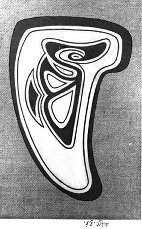
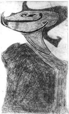
Fig. 3. The salmon-trout head motif of Haida art, from the north-west
coast of North America.
Tagore came to art via primitivistic form-making, making grotesque zoomorphic
patterns in black and white. In the context of our investigation, it is
important to note that he entered art through the corridor of black and
white form-making. He must have studied a lot of artefacts, masks and other
ritual-cum-decorative objects from tribal cultures, in life and in reproduction.
These gave him some of the ideas for his famous MS doodlings, out of which
his art emerged. The Kala Bhavana library still holds a richly illustrated
book called The Art of Old Peru (1924), which could have well accompanied
him on his voyage on the Andes that year, when he started the doodlings
in the famous ĹPurabi manuscriptĺ. Not knowing Bengali, Ratan Parimoo had
imagined that Tagore had not mentioned primitive art in any of his writings.
But actually Tagore was aware of the theoretical importance of returning
to primitive art; he talks about it in his journal Paschim-yatrir Diary
in an entry (14 February 1925) written on the last leg of his journey home
from South America. Parimoo was also unsure if Tagore had expressed any
interest in the art of the South American cultures. But our picture of
this part of Tagoreĺs life is much clearer since the publication of my
own researches on his Argentine adventure. Tagore did wish to explore the
art of the Amerindians and was vexed at not being able to go to Peru and
Mexico. In Argentina he saw books about the Incas, expressed his interest
in their art and his sadness at the destruction of their artefacts, and
also examined a rich collection of Quechua images and textiles. Artefacts
continued to inspire him even when he had made good progress in art and
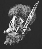
had started working in colour. In Ronger Rabindranath we have demonstrated
resemblances between his works and a wide range of artefacts, of a truly
global provenance: African, Malanggan, Chinese (bronzes), Peruvian, Haida,
Tlingit. The resemblance between his famous signature-seal designed by
himself, made out of his initials in Bengali, and the salmon-trout head
motif of Haida folk art is revealing. This was one of the most marvellous
resemblances Sushobhan traced, amounting to a stunning discovery.
Fig. 5. Malanggan artefact, mask, boarĺs head, from the north of
New Ireland, north-west coast.
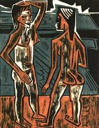
We looked at the influence on Tagore of the total phenomenon of Expressionism, including writing, graphics, painting, and sculpture. The attraction to primitive art, the distortion of form, and the aberrant use of colour were clear markers. Theories of colour mysticism (Itten, Kandinsky) and contemporary speculations on synaesthesia are likely to have interested him, and it is possible that some influence of German Expressionist drama had percolated to his drama also. The Expressionist artists themselves had been profoundly influenced by non-European art and artefacts, including the art of Ajanta in reproduction. Tagore being influenced by the Expressionists is the other half of the cycle. In particular, Tagore seems to have learnt a lot from the Expressionist woodcut, both black-and-white and coloured: the angular composition, the division into simple coloured planes, the use of the anti-line. He tried to mimic the texture of the woodcut print in pen-and-ink work. We believe we are the first researchers to have looked at the influence of the Expressionist woodcut on the development of Tagore the artist. Tagoreĺs colour vision deficiency almost certainly inhibited and delayed his development as a visual artist. He never had the confidence to take formal lessons in art, though he encouraged his nephews, Abanindranath and Gaganendranth, to do so. He did not try to learn European-style naturalistic painting, though his own poetry of the 1890ĺs and the writings of his nephew Balendranath Tagore from the same period, which were closely supervised and monitored by him, clearly show the influence of the female nude of classical Western art. Sushobhanĺs analysis of the influence of the female nude of Western art on Tagoreĺs verse drama Chitrangada (1892) and on the poems of Chitra (1896), including ĹFarewell to Heavenĺ and ĹThe Victorious Womanĺ, poems I had myself translated, elicited my unreserved admiration. It was exciting to wander in the National Gallery of London with him, wondering which paintings Tagore might have seen with his own eyes during his visit there in 1890. Most interestingly, though Tagoreĺs poetry explored many stories and
legends from Indian antiquity, he did not follow the parallel movement
in art, the Bengal school, with its pale pastel colours and wash technique.
Abanindranath excelled in this, but excellence in this technique could
not be achieved by someone with a colour vision deficiency. Tagore felt
a stronger attraction to Japanese art, which was linked to calligraphy,
but the vigorous strokes of brush and ink needed for developing that style
would have needed an enormous amount of training, for which Tagore had
neither time nor patience. He found a route to art through primitivistic
form-making, developed it through studying the woodcut, then developed
it further by studying the way Expressionist artists were breaking all
rules in the construction of forms and the application of colours. These
studies gave him the confidence to become a painter in the fuller sense.
He must have realized that his deficiency was no ultimate block; it could
be bypassed. It was not necessary to be naturalistic in the use of either
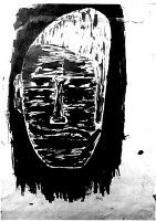
forms or colours. Amongst the plates in our book we have included some
studies of faces with strikingly unconventional colouring. Real confidence
in the use of colours came to him in the thirties, after he had successfully
exhibited his pictures in Europe in 1930, and when he had had a substantial
exposure to contemporary European art. Interestingly, as he gained confidence
in the pictorial art, and in the use of colours in his pictures, he also
gained a new vibrancy of colour language in his literary work. We have
tried to make these connections. Sushobhan has traced some striking similarities
in formal composition, and sometimes in colour composition, between some
of Tagoreĺs work and various examples of Expressionist art. These similarities,
as well as the similarities between Tagoreĺs work and exotic artefacts,
are well illustrated in the plates in our book. Sometimes, as with certain
paintings done by the Northern German Expressionist Emil Nolde and some
done by Tagore, there is an intriguing similarity in composition, and even
in the use of certain colours like yellow or violet, but Tagoreĺs own use
of reds is more muted. Tagore always referred to his art as a playful activity,
playing with lines, splashing about with colours. Nevertheless, the range
of colours in his paintings is limited. They exhibit a Ĺrestricted colour
spaceĺ, in consonance with what one might expect of a protanopic artist.
Fig. 7. Max Pechstein, ĹZwiespracheĺ, coloured woodcut, 1920.
He tends to paint dark scenes; there is a lot of brown. Brown might well have been a dominant colour in his field of vision; there might have been an overlap between his perceptions of green and brown. Quite a number of his paintings are actually monochromatic, each simply working out tonal variations of one hue, avoiding colour contrasts. There is even a composition which uses red in this way. Interestingly, while he sings hymns of praise to the colour blue in his writings, he does not use a great deal of blue in his paintings. One could explain this phenomenon in the following way. Blue was the most vivid hue in his field of vision. He celebrated it in his literary work, but he was not interested in experimenting with it in his visual art because he knew what it was all about. He was far more interested in understanding what the colour red was all about, that area of darkness about which others were so ecstatic, and in the range of the colour called green. Tagoreĺs visual art was nothing if not experimental, and while linguistic references to colours had to maintain some kind of relationship to conventional language and its associations, experiments with colours in paintings could be conducted with no holds barred, especially under the auspices of Expressionism. It is because of this that the evidence in favour of protanopia is more clinching in Tagoreĺs literary works than in his paintings. If a critic wishes to reject the hypothesis of protanopia, he may explain away the anomalous uses of colour in Tagoreĺs paintings as deliberate colour-experiments under the influence of Expressionism. On the other hand, in his writings, the language, precisely because it has to negotiate with conventional colour-codes, reveals problematic areas when probed with the colour-key. Also, in the period when Tagore is not self-conscious about his colour vision deficiency, he can sometimes reveal the problem inadvertently through an innocent comment. Such a comment occurs, for instance, in Yurop-yatrir Diary, his account of his European travels of 1890. Talking about the facial complexion of Italian women, he says that their colour is like that of grapes, not much whiter than that. A confusion between pale pink and pale green falls, of course, within the protanopic confusion zone. When did Tagore become aware of his problem? Perhaps in the last decade of the nineteenth century. The jocular comment about himself as ôa celebrated colour-blind personö was made in a letter to Indira Devi in 1894. It is likely that his association with the scientist Jagadishchandra Bose in the closing years of the nineteenth century and the beginning of the twentieth helped him to acknowledge the existence of a problem. From a letter of the scientist to the poet in March 1900, to which Shobhan Som has drawn our attention, it seems that Bose considered Tagore to be green-blind. It must be remembered that at that time scientists were just coming to an understanding of the phenomenon of colour vision deficiency: the overlap and the fine distinctions between red-blindness and green-blindness were not all that clear to scientists and the standard tests that are used today had not been devised. Almost a half of the jars, tins, bottles in Tagoreĺs paints box, held in the archives, are forms of red or green. There is reason to believe that a lot of the dark colours in his paintings are due to his ceaseless colour experiments. To understand the natures of red and green, those two colours which were in his area of confusion, he must have Ĺmixed and matchedĺ pigments like a man possessed. Mixing will soon turn green to brown. Clear green appears only rarely in his oeuvre, and he sometimes uses red in anomalous ways. His Ĺsuccessfulĺ (that is to say, conventional) uses of red are usually in simple, contained areas. He seldom gives us red-green contrasts. As in literature, so in painting, light and dark constitute his favourite contrast. As critics know, one of his favourite techniques was to put layers of coloured ink on paper, one layer on top of another, creating dark areas outlined or criss-crossed with luminosity. What is remarkable is that in spite of any problems he may have faced, he does create a haunting world of forms and colours in his pictures, a unique visual world stamped with a style which we instantly recognize as his. In our book we have supplied extensive information to suggest how significant the German connection was for Tagoreĺs development as an artist. He took an interest in graphics and printing, and sent his grandson to Germany to study print technology. We have given a list of foreign art publications existing in the archival collection of the Kala Bhavana library. These include a large number of German titles, including three volumes (1919, 1920, 1921) of the famous Genivs and Die Kunst des 20 Jahrhunderts (1928), packed with prints. We followed up the leads given by Parimoo on the Bauhaus exhibition in Calcutta in 1922 as best as we could. People in charge of the Bauhaus archives (now in Berlin) believe that Tagore visited the Bauhaus school in Weimar in 1921, but we have not been able to unearth any documentary evidence in support of this. It is, however, very plausible that Tagore did play a role in the arrangement of the Calcutta exhibition. His reputation in Germany was then at its peak, and a request in his name would have undoubtedly facilitated the despatch of the exhibits to Calcutta. We have considered the whole art ambience in Calcutta within which such an exhibition became possible, and the warm reception it received. As is known, the exhibits were never returned to the Bauhaus school. That remains a mystery and a scandal. But different strands of Expressionism left their mark on Rabindranath and Gaganendranath. In 1930 German art critics recognized the influence of German Expressionism on Tagoreĺs art. Though we have not been able to throw any new light on the whereabouts of the Bauhaus exhibits, we have been able to throw some light on the fate of the Ĺfive lost paintingsĺ of Tagore, which he had given to the National Gallery of Berlin in 1930 and which had been seized by the Nazis in 1937 along with other paintings when they raided art galleries to rid them of Ĺdegenerate artĺ. We also offer assessments of the critical responses to Tagoreĺs art in the West after the exhibitions of 1930, including a critique of Coomaraswamyĺs response. In conclusion, if Tagore was a protanope, then he was arguably the greatest protanopic creative genius the world has ever seen. He has left us an ocean of words, melodies, and visual images. There could well be a connection between his colour vision problem and the exceptional fecundity of his genius. Perhaps the experience of a handicap, the condition of perceiving things differently from others, the consequent struggle with communication, hones a personĺs sensitivity, sharpens the edge of genius, encouraging intense self-expression in a million different ways. There is a lesson to be learnt by all of us from seeing a genius struggling with and overcoming his handicap. In addition to asking interested readers of this article to look up the English-language pages of our book, we would invite those who can read Bengali to cast a glance (if not out of passionate intellectual curiosity, then at least out of a loitererĺs idle curiosity!) at the hundreds of pages of detailed analysis we offer in the Bengali section, and at the art plates indicating the likely shaping influences on Tagoreĺs art. The purpose of this article is not to tell readers of these pages everything about the book: it is not easy to summarize such a large book. We have been accused of squeezing three books between two covers, but surely it was better to write up the results of all our searches and researches together in one volume as long as our own enthusiasms and energies were still burning, and whilst Ś an important consideration Ś the publisher was still committed to such a risk-taking publication. My purpose here is to whet your appetite for the details, which will enable you to look at Tagoreĺs themes and images (both verbal and visual) in a new light. If you allow us to take you on a conducted tour of the colour-world of the man who wrote: ôAaj shobar ronge rong mishate hobeö Ś ôToday I must blend my colours with everyone elseĺs coloursö, many lines of Tagore with which you are already familiar will reveal new vistas of meaning.
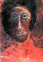
Figure 9 Fig. 9. Rabindranath Tagore, Rabindra Bhavana collection 2467. Waterproof ink on paper, 1-3-1936. A portrait showing an unconventional use of colour. Is the colour red on the neck and chest of the figure meant to be skin-colour or the colour of the manĺs shirt? _____________________ * Published by Ananda Publishers Private Ltd, Calcutta, 1997. ISBN
81-7215-673-1. Awarded the Sureshchandra-smriti Ananda Puraskar, 1997.
The end-notes in the book contain full details of those books and papers
we have consulted for our study.
|
 |
 It has been suggested to me several times by friends that I should write
an article in English reporting on the interdisciplinary research work
that is embodied in the book Ronger Rabindranath/ Rabindranather Sahitye
o Chitrakalay Ronger Byabahar, written by myself and Sushobhan Adhikary
of Santiniketan with the scientific collaboration of Adrian Hill and Robert
Dyson.